Trends | Color Design Trends for 2026
Today, Top Pound would like to share a color design trends for 2026, which released by Dunn-Edwards, a well-known American paint brand. This trend is divided into two major series: "Quiet Joy" and "Notable Neutrals". The former uses vivid colors to arouse the emotions of the space, while the latter lays a comfortable foundation with warm neutrals. Let's get to know these carefully selected colors!
Quiet Joy
The core of the "Quiet Joy" series is to satisfy people's longing for "a stable, nourishing and delightful space". Say bye to cold and harsh tones. These nine colors not only bring a familiar sense of intimacy but also carry a fresh sense of design. They can infuse the soul into residential or commercial spaces, making every corner a carrier of stories.

As the color of the century, Viridian Odyssey is a deep, mysterious blue green with a calming, sophisticated presence. Which evokes the sense of a journey through time, the calming presence of the ocean.
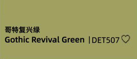
It's a lemon green with a hint of yellow, just like a color that has stepped out of a 19th-century Gothic Revival building. It has the natural texture of plants and hides a sense of nostalgic luxury.
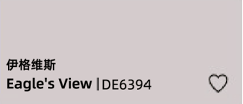
Imagine the comforting softness of your favorite blanket. Eagle's View is just like that. It's a soft, muted mauve with a wash of gray; a complex, blushing neutral that feels calm and romantic, but not in an overly sentimental way.
A pale sky blue with a slightly faded look, like the cloudless clear sky and the soft hue of old jeans, it is a cool color that can brighten up the space.
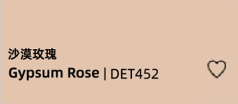
The soft earthy peach pink is inspired by the rose form created by gypsum crystal clusters in the desert. It's like the delicate blush on a seashell and the first gentle touch of the morning light.
In addition, the "Quiet Joy" series also includes the vibrant coral terracotta color of Cedar Grove, the buttery summer feeling of the pale yellow of Sonoma Chardonnay, the oxidized vintage beauty of Antique Coin, and the luxurious feeling of the wine brown of the Purple Prose. Each color can precisely match different style needs, making the space bid farewell to monotony.
Notable Neutrals
If "Quiet Joy" is the leading role of the space, then "Notable Neutrals" are the most reliable supporting roles —— there are 8 hues ranging from light to deep, naturally exuding a sense of simplicity and stability. They can not only make bold colors stand out more but also create a sense of sophistication in the space on their own. They are the versatile all - match in design.
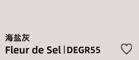
Like the foam of waves crashing on the beach, this light and neutral gray has a transparent touch and is suitable for most design styles.
The warm and bright white color combines the texture of a vintage residence with the freshness of a modern space. It is a "never-wrong" neutral color.
The medium-tone brown conceals a soft rose tone, resembling leather that has been aged over time. It exudes both a sense of refinement and comfort.
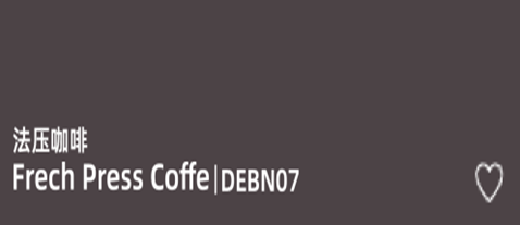
A deep and rich brown with a reddish-purple undertone. Like the perfect coffee enjoyed on a rainy day, it exudes a warm and comforting aura, transforming any space into a luxurious and private retreat.
In addition, each color in the Notable Neutrals series, such as the rustic earthy brown of Country Rubble Stone, the warm off-white of Antique White, the toasted brown-orange tone of Apple Cinnamon, and the rich purplish-red brown of Outer Boundary, can be flexibly matched according to the spatial needs. Whether you are aiming for the comfort of interior decoration or the outdoor style, they can be perfectly adapted.
Conclusion
The core of this color trends for 2026 is "true beauty lies in the daily life" —— with the tranquility of Viridian Odyssey, the tenderness of Gypsum Roses, the transparency of Fleur de Sel, the warmth of French Press Coffee, etc., to make the space no longer a cold container, but an emotional field that can nourish the soul. So what kind of colors could become the color trend for 2026? Welcome to leave your thoughts in the comments!

